Designing an accessible digital experience for seniors and caregivers.
Services
Research
UX Design
UI Design
Industry
Healthcare
Role
Lead UX Designer

Overview
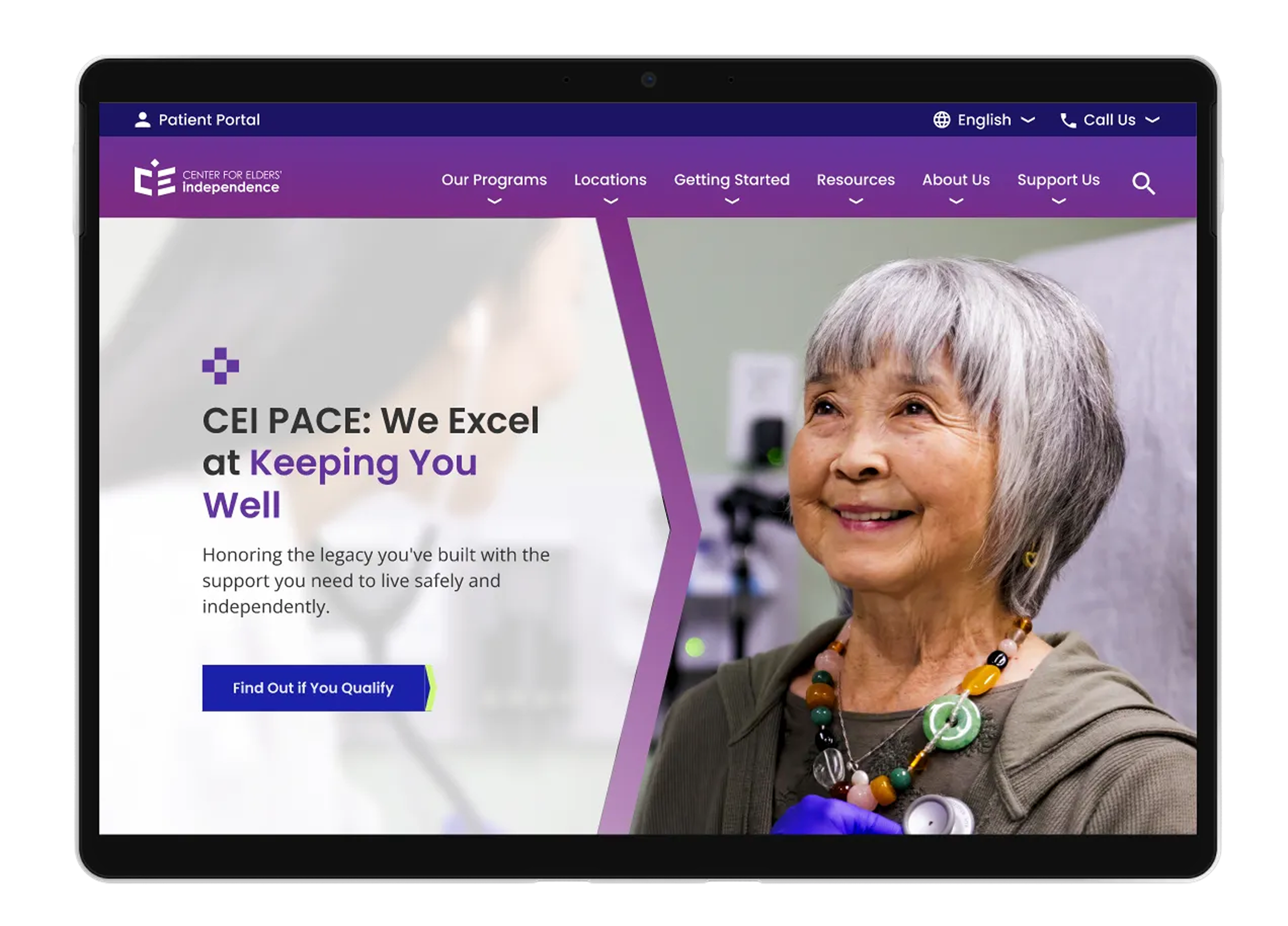
The Center for Elders’ Independence (CEI) provides coordinated healthcare and supportive services for older adults through the PACE (Program of All-Inclusive Care for the Elderly) model. As CEI expanded its programs and locations, its website struggled to clearly communicate services, guide caregivers and participants, and support future content growth.
As UX Lead, I helped reframe the digital experience around trust, clarity, and decision-making—designing a structure that supported both seniors navigating care for themselves and caregivers advocating for loved ones.
The Core Problem
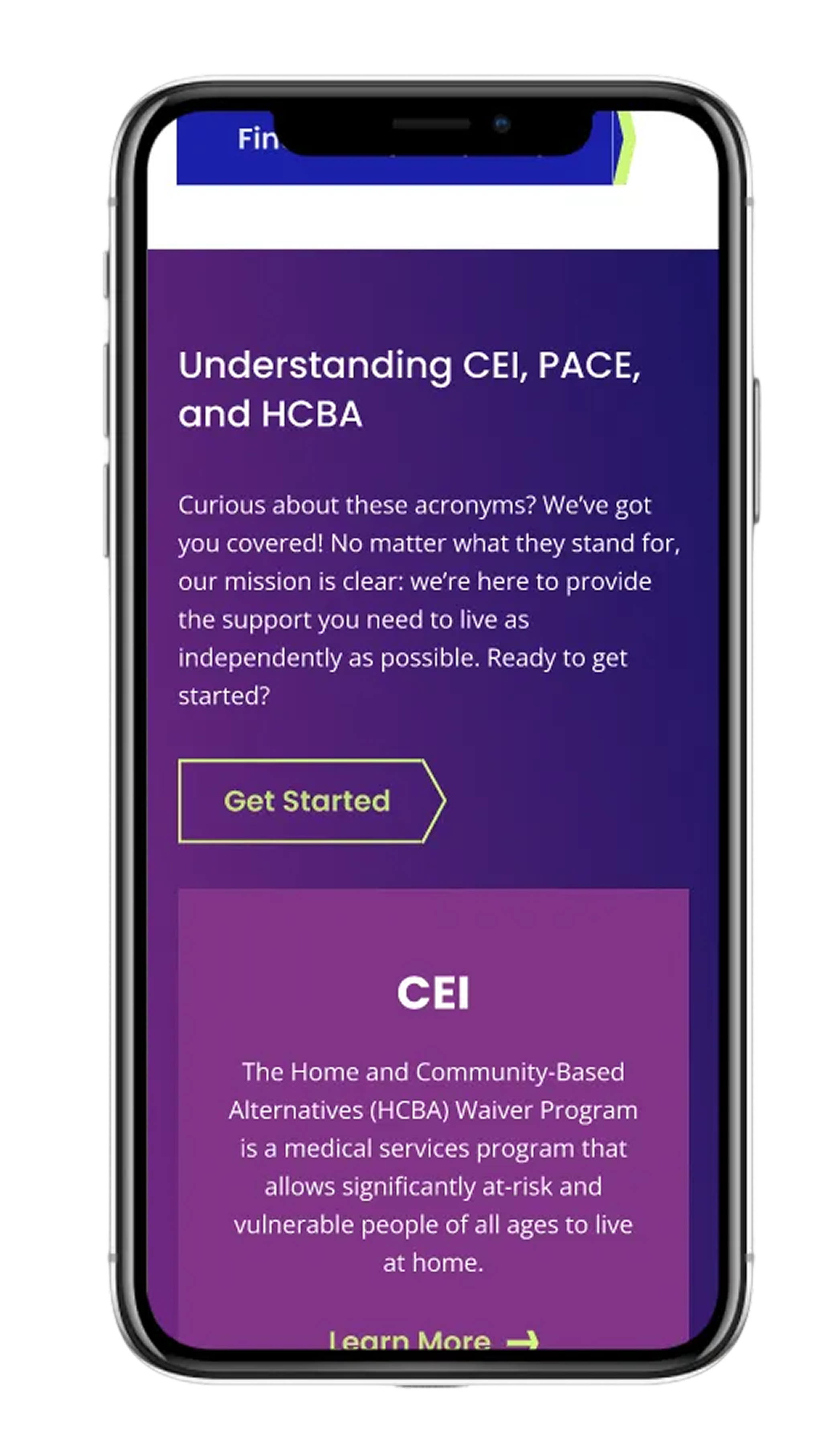
This wasn’t simply a redesign problem—it was a comprehension problem.
Through research insights and stakeholder conversations, we saw that:
many seniors didn’t understand what PACE was
caregivers struggled to compare options and make confident decisions
cost misconceptions created hesitation
users felt overwhelmed by healthcare terminology
the site required users to piece together information across pages

Guiding Design Principle: Clarity Builds Trust
Rather than focusing only on a visual refresh or feature improvements, I centered the work on one guiding principle:
If users can understand CEI quickly, they can trust it.
This principle informed everything from IA decisions to homepage storytelling and conversion pathways.
Reframing around questions
Will I lose my independence?
How much does it cost?
Is this right for my loved one?
Instead of organizing content by internal structure, I helped shift the experience to answer the questions users were already asking:
Let’s execute. 🫡
🗂️ Card Sort
To explore how users naturally group information, we conducted card sorts to understand:
content alignment
mental models
preferred terminology
category clarity
🌳 Tree Jack Testing
Building on card sorting insights, tree testing helped validate:
whether users could find key information
the effectiveness of existing taxonomy
the clarity of labels and groupings
This provided quantitative evidence for IA improvements.
👩🏽💻 Usability Testing + IDI
I moderated bilingual sessions using Google Meet and Optimal Workshop, covering:
✔ participants' healthcare experiences
✔ trust, digital literacy, and sources of information
✔ provider preferences
✔ perceptions of AltaMed
✔ 5 core usability tasks (e.g., finding a doctor, checking accepted insurance, locating services/resources)
Sessions were planned for 90 minutes and conducted closer to 60 minutes to prevent fatigue.
Audience Segments
Using legacy personas as a starting point, I identified updated segments grounded in current patient behavior, analytics, and community characteristics:

Family Shoppers
Make healthcare decisions for multiple family members

Individual Shoppers
Make decisions only for themselves

Senior Shoppers
55+ patients navigating multilingual, digital, and trust-related barriers
Recruiting & Outreach
Digital recruitment methods were ineffective due to:
low digital literacy among some users
distrust of online outreach
fear of scams
limited familiarity with research participation
So I led an in-person, community-centered recruitment strategy, visiting:
local parks
mercados
senior centers
shopping centers
I distributed flyers, spoke directly with community members, and built trust through conversation.
This pivot required advocating with stakeholders—but ultimately secured approval and dramatically improved participation.
This approach ensured representation from users who are often the least likely to be heard.
The Sessions
The Sessions

User interviews + usability testing sessions were held virtually through use of Google Meet, Calendly for scheduling, Outlook for contact with participants, and various AI tools to aid with notetaking and recording.
They were scheduled for 90 minutes but kept closer to 60 mins to avoid fatigue.
Participants were asked about their experiences with healthcare, sources of information, provider preferences etc.
Half of the session was reserved for usability testing which included 5 tasks resembling common activities found on a providers website (i.e. finding a doctor, finding accepted insurance, finding resources/services)
Card sorting and tree jack testing were unmoderated through Optimal Workshop.
Lessons Learned
This project had profound personal significance. As a Latina researcher working with communities similar to my own, I felt deeply connected to the participants’ stories.
Although specific findings are confidential, broader themes included:
1. A generational digital divide
Older adults desire human connection and feel overwhelmed by digital systems.
2. Younger audiences prioritize values + usability
Provider selection was increasingly influenced by digital experiences and brand trust.
3. Middle-aged users feel “forgotten” by tech
They want digital tools but find the current systems confusing or cumbersome.
Despite preferring traditional communication, they desire modern, intuitive digital support.
4. Trust is everything
Participants expressed concerns about accuracy, complexity, and lack of clear guidance—highlighting the critical role of accessible, culturally informed design.
Explore some other case studies!

CDC User Research

Clinical Service Management System