AltaMed | User Research With Underserved Latino Communities
Lead UX Researcher & Designer — Research · Strategy · Design
Overview
AltaMed serves more than 300,000 patients across Southern California—many from historically underserved Latino communities. As the lead UX Researcher & Designer, I conducted a mixed-methods study to understand patient experiences, digital barriers, post-pandemic behavior shifts, and opportunities to improve the overall digital ecosystem.
I led end-to-end research including materials development, bilingual moderation, community outreach, recruitment, synthesis, and insight presentation.
Context
AltaMed’s last major website redesign was in 2017. Since then:
the organization expanded services
user expectations evolved
pandemic-era digital habits dramatically shifted
To ensure the site continued meeting the needs of diverse patients—many multilingual, older, or navigating complex healthcare systems—we conducted a comprehensive evaluation grounded in real user perspectives. The research set out to:
Evaluate the current website experience
Identify usability barriers, navigation issues, and gaps in content strategy and user flows.
Understand post-pandemic shifts
Explore how expectations, fears, and preferences changed for Latino communities accessing care.
Uncover patient needs and perceptions
Hear directly from users about trust, digital access, and decision-making behaviors.
Provide actionable recommendations
Support future AltaMed projects with data-driven guidance rooted in community realities.
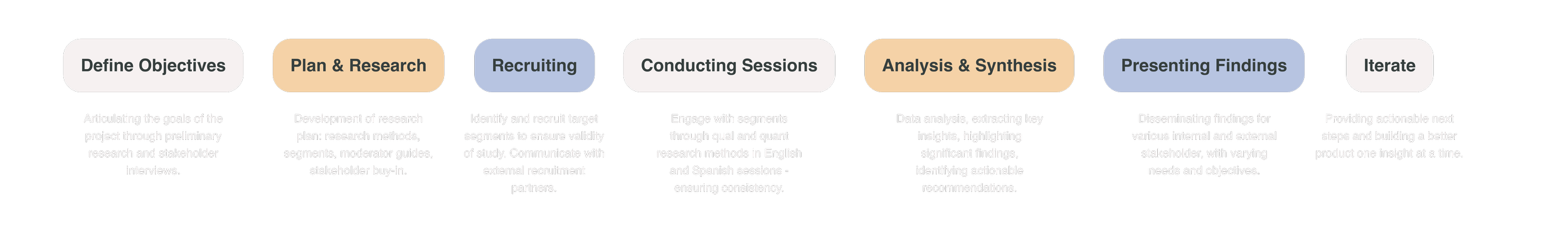
Research Process
Heuristic Evaluation
A heuristic evaluation utilizing Neilson and Normans 10 usability heuristics was conducted to get myself and another team member started on evaluating the site and pinpointing any immediate concerns. This allowed the team to get an initial footing on the task at hand and start conceptualizing the direction for the tasks to be used within usability testing.
Pilot Study
We conducted a pilot study with internal non-project staff to: validate our tasks, test timing, refine prompts, ensure clarity.
While not representative, the pilot confirmed our hypotheses and strengthened the final study design.
Early themes identified:
Navigational inconsistencies
Content misalignment
Unconventional design patterns

Let’s execute. 🫡
🗂️ Card Sort
To explore how users naturally group information, we conducted card sorts to understand:
content alignment
mental models
preferred terminology
category clarity
🌳 Tree Jack Testing
Building on card sorting insights, tree testing helped validate:
whether users could find key information
the effectiveness of existing taxonomy
the clarity of labels and groupings
This provided quantitative evidence for IA improvements.
👩🏽💻 Usability Testing + IDI
I moderated bilingual sessions using Google Meet and Optimal Workshop, covering:
✔ participants' healthcare experiences
✔ trust, digital literacy, and sources of information
✔ provider preferences
✔ perceptions of AltaMed
✔ 5 core usability tasks (e.g., finding a doctor, checking accepted insurance, locating services/resources)
Sessions were planned for 90 minutes and conducted closer to 60 minutes to prevent fatigue.
Audience Segments
Using legacy personas as a starting point, I identified updated segments grounded in current patient behavior, analytics, and community characteristics:

Family Shoppers
Make healthcare decisions for multiple family members
Individual Shoppers
Make decisions only for themselves
Senior Shoppers
55+ patients navigating multilingual, digital, and trust-related barriers
Recruiting & Outreach
Digital recruitment methods were ineffective due to:
low digital literacy among some users
distrust of online outreach
fear of scams
limited familiarity with research participation
So I led an in-person, community-centered recruitment strategy, visiting:
local parks
mercados
senior centers
shopping centers
I distributed flyers, spoke directly with community members, and built trust through conversation.
This pivot required advocating with stakeholders—but ultimately secured approval and dramatically improved participation.
This approach ensured representation from users who are often the least likely to be heard.
The Sessions
The Sessions
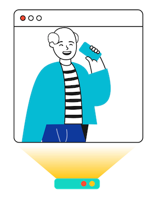
User interviews + usability testing sessions were held virtually through use of Google Meet, Calendly for scheduling, Outlook for contact with participants, and various AI tools to aid with notetaking and recording.
They were scheduled for 90 minutes but kept closer to 60 mins to avoid fatigue.
Participants were asked about their experiences with healthcare, sources of information, provider preferences etc.
Half of the session was reserved for usability testing which included 5 tasks resembling common activities found on a providers website (i.e. finding a doctor, finding accepted insurance, finding resources/services)
Card sorting and tree jack testing were unmoderated through Optimal Workshop.
Lessons Learned
This project had profound personal significance. As a Latina researcher working with communities similar to my own, I felt deeply connected to the participants’ stories.
Although specific findings are confidential, broader themes included:
1. A generational digital divide
Older adults desire human connection and feel overwhelmed by digital systems.
2. Younger audiences prioritize values + usability
Provider selection was increasingly influenced by digital experiences and brand trust.
3. Middle-aged users feel “forgotten” by tech
They want digital tools but find the current systems confusing or cumbersome.
Despite preferring traditional communication, they desire modern, intuitive digital support.
4. Trust is everything
Participants expressed concerns about accuracy, complexity, and lack of clear guidance—highlighting the critical role of accessible, culturally informed design.
Explore some other case studies!

CDC User Research

Clinical Service Management System